- Branding and Marketing
- Dec 21
10 landing page designs to inspire your business in 2019
Landing pages act like digital entities for promoting and selling your products or services. An effective page will display much-needed information that will further entice your visitors to convert. Today’s visitors are fickle-minded beings with short attention spans and are averse to marketing gimmicks. Hence, tacky images and lines of empty promises no longer bode well.
Luckily for you, designing a landing page has also gotten simpler. So with 2018 drawing to a close, it’s time to review and refresh the keys to a successful site. But first, let’s recap on the two commonly-used landing page structures:
• Click-through page: as the name implies, this type allows visitors to “click-through” to another page, where they can find a detailed description of the product. Most e-commerce websites prefer this, as visitors tend to buy more when they see detailed descriptions instead of generic ones.
• Lead generation page: also known as a standalone page, this type is most often used for marketing or advertising campaigns, with one objective-the call-to-action button. This type of landing page is often visited from a click on an online ad in the digital space.
We believe in learning by example so here are a few of our favourites, featuring landing pages from various industries and business fields. One thing to focus on when building your page is not on perfection, but in adapting to your target audience’s preferences and need. So get your creative juices flowing and start creating websites that actually work!
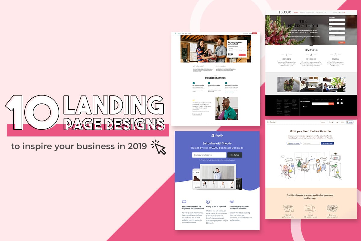
1. Airbnb
Convenience and personalisation are two things that people look for in our generation, and Airbnb does this well. To entice more visitors to become hosts, a monthly estimation of earnings surely is a clever hook. The clean, white design made the bold and simple fonts pop.
Plus, it does help that the call-to-action button stands out and can be found throughout the page so it makes it easy for you to sign up with a click.
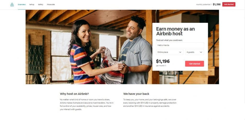
2. H.BLOOM
This landing page is one of the most serene and beautiful sites we visited. It’s clear that they were not shy in using high-resolution images and yet, we were surprised at how fast the page loads!
Apart from the gorgeous design, we liked the registration form and instructions on how the service works above-the-fold so we can decide right away without having to scroll down. Even then, there is not much to scroll down to as all the information you need is found right when the page loads. Another win for usability! The only comment we had was the font colour of the page header main title “A Perfect Touch”, as the black took a while to make out as compared to the white fonts accompanying it below.
3. Industrial Strength Marketing
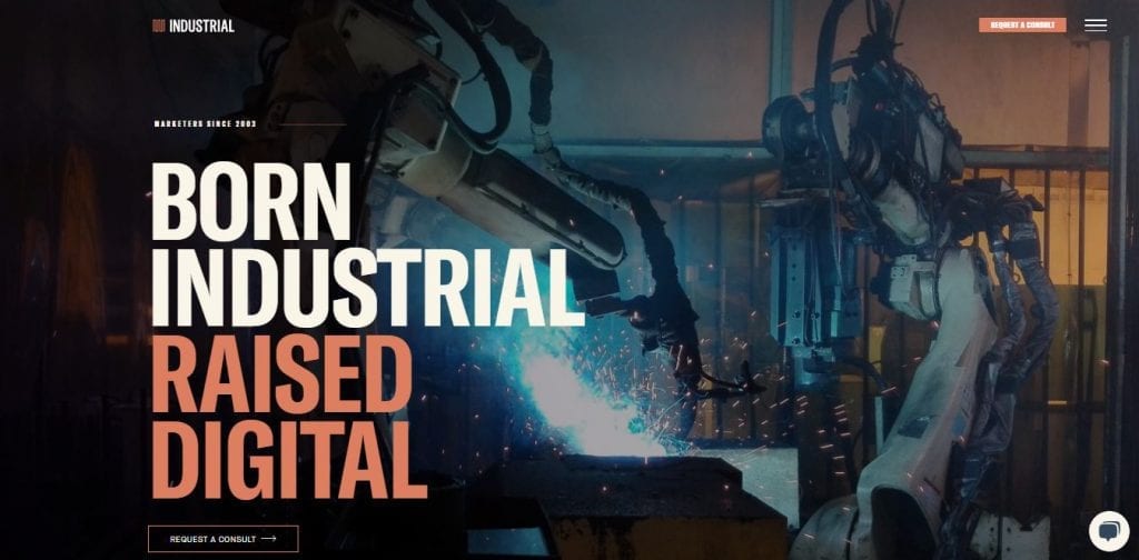
We had mixed feelings about the “Transformers” type layout of Industrial Strength Marketing, so much so we double checked to ensure that we landed on the right landing page.
The large and bold fonts certainly caught our attention and they branded themselves well as a marketing and branding arm for industrial companies, with simple icons to illustrate how they work and the services they provide.
4. Muzzle
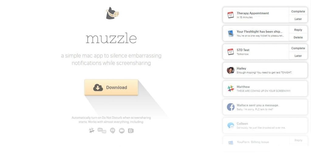
Most businesses are all about providing solutions to customer problems and they made sure to make it known right on the landing page. But Muzzle, a Mac app that silences on-screen notifications, has a different idea that is equally genius.
They focused on the value proposition instead and included a humourous yet very real notifications thread on the upper left of their landing page. This animated idea needs no step-by-step instructions or long-winded descriptions. Now, visitors will be enticed to stay on and know more about your business!
5. Teambit
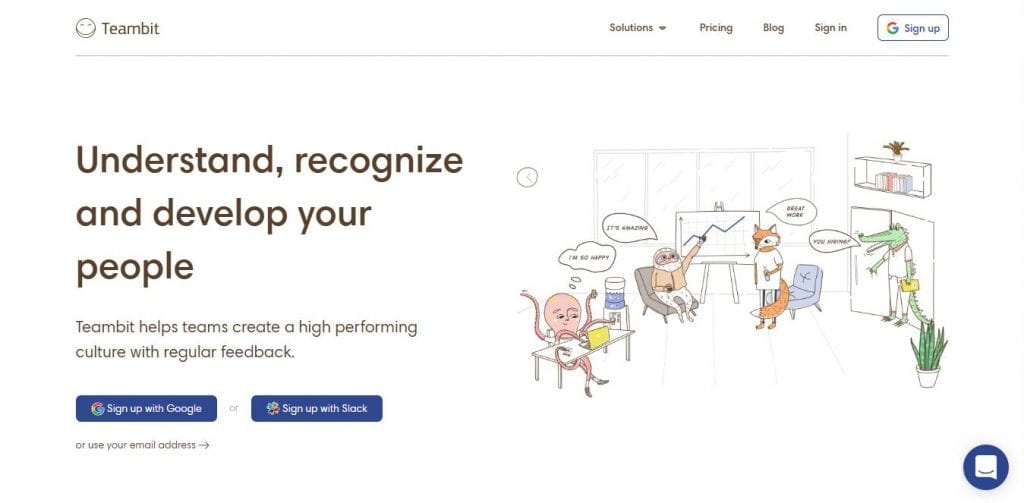
Like straight out of a comic book, Teambit provides an unusually comical take on human resource. By building an illustration-focused site that reminds us of Fantastic Mr. Fox, they aim to make an unforgettable impression from top to bottom! It’s obvious that the animal cartoons love flaunting their stuff throughout the site, making something dull like a HR process, fun!
6. Unbounce
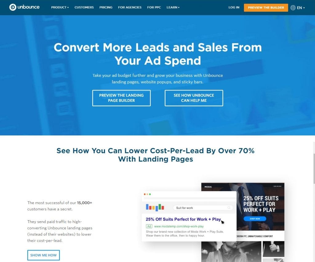
Who doesn’t know Unbounce? They are one of the pioneers in creating high-converting landing pages. Hence, it’s no surprise that their site is pretty stellar in terms of usability and responsiveness.
Their landing page is full of descriptive and well-thought-out content that helps boost their SEO as well. We mentioned before about the importance of a value proposition and Unbounce does it well by bringing in facts in numbers to prove the effectiveness of their business.
It’s no surprise Unbounce is near the top of this list — they’ve actually written the book on creating high-converting landing pages. Although there are lots of amazing things about this landing page, the two that I absolutely love are: 1) The use of a chat window instead of a classic form, and 2) the detailed — but well packaged — information below the form.
The first helps direct attention to the goal of the page — for you to fill out the form — in a way that’s unobtrusive and feels less like a chore.
The second gives this page an SEO boost (search engines will have more content to crawl) and assuages any worry from folks who need to know more about a piece of content before handing over their information, all while not distracting people from the chat window.
7. Shopify
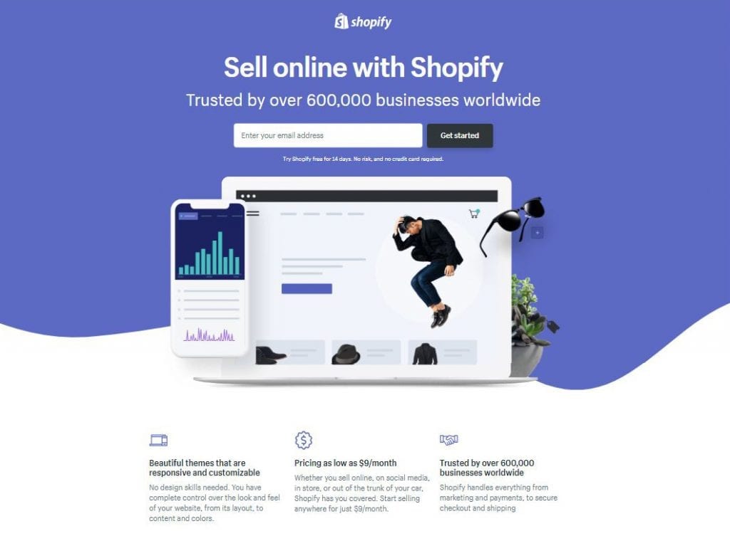
In this day and age, everyone has a small business enterprise of their own, and Shopify provides the best platform for online sellers who want a customised online store.
The landing page is easy to navigate and tells you three simple things: What they do, who have used their services and a call-to-action to get started. Sometimes, all you need are few words to get your point across and Shopify does it well with just a few lines to communicate their ability to help you sell online without any fuss.
8. Wistia
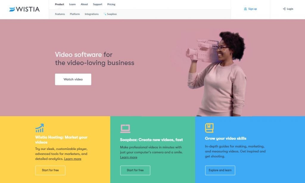
We all hate being bombarded with the pressure to register an account or subscribe to a newsletter when we visit a site. Wistia, a video-hosting solutions company, played on a different approach.
Their landing page loads onto an interesting animation that depicts their raison d’être. By clicking “Watch Video”, the animation opens up to an extended version, which further engages the visitor. Based on studies, this strategy is so effective because 8 out of 10 people will most likely stay on and read more about your services.
9. Lyft
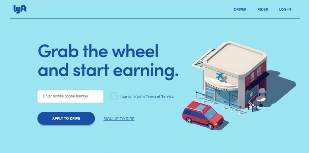
With millions of websites to browse through, it’s so important to know exactly what your visitors are looking for when they visit your site. Lyft, a ride-sharing application operating in 300 cities in the United States, understands this.
Their landing page is concise and straight to the point. We love the attention-grabbing header, “Grab the wheel and start earning,” which exemplifies who their visitors and target audience are. After which, they can then convert easily by applying to drive or signing up to ride.
10. Forbes
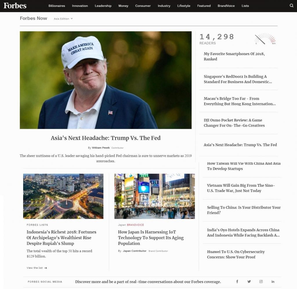
For a news site, Forbes is no stranger to the online media arena. With their ever-growing presence and digital audience, they must be doing something right with their website to keep visitors coming back for more.
One of the main features for a digital content site is its responsiveness on portable devices since most people read the news on their commute to work. Forbes has done this well while still maintaining a clean interface overall. For easier navigation, they also made sure their headers and subheaders are interrelated and break the article well. Using data to track the behaviour of their visitors helps in generating insights to which types of articles are trending and vice versa.
Speak with us here and let us help you determine what works best for you!
Related Posts
Three amazing social media campaign ideas and why they worked
As a marketer, social media campaigns are one of a few great ways to promote your brand or market your product or services. It’s for the best that you keep your social media content postings…
- May 16
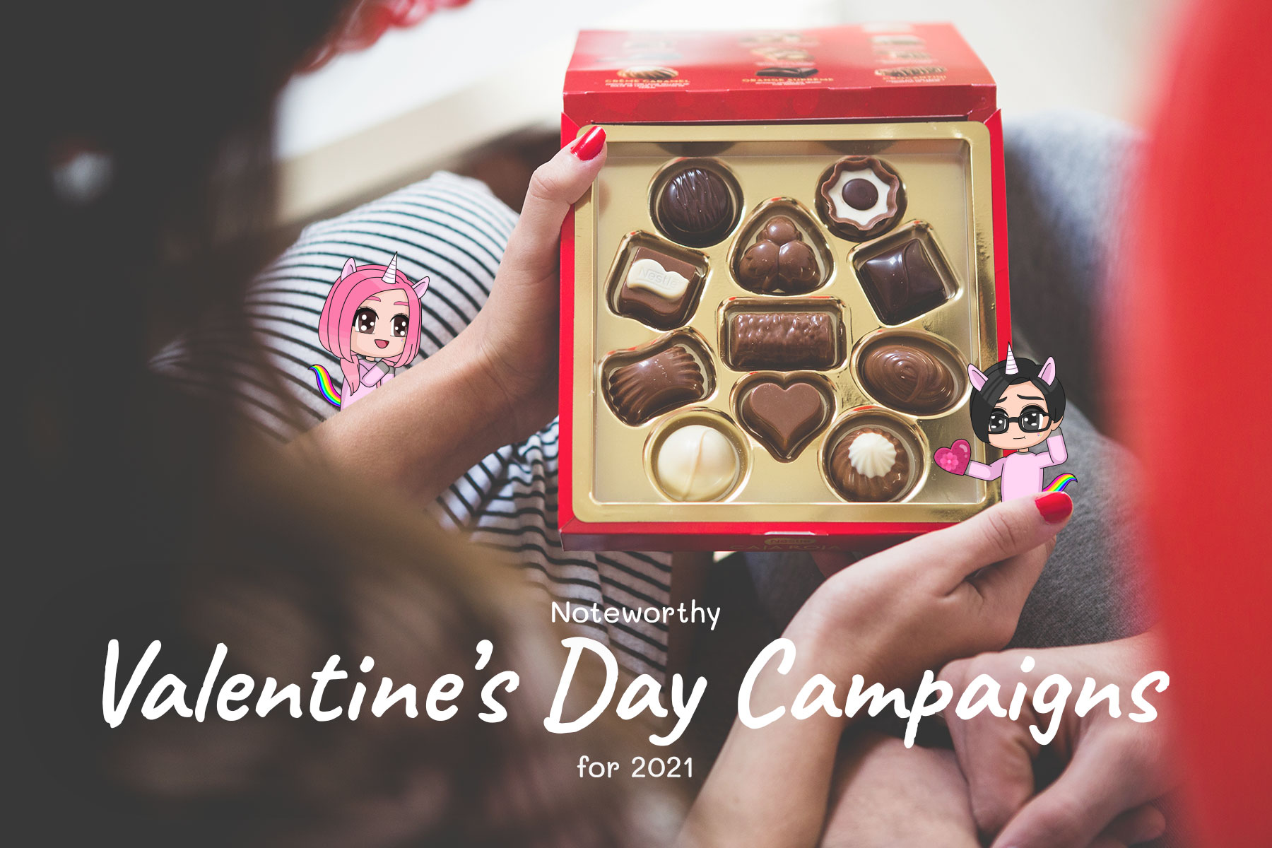
Noteworthy Valentine’s Day Campaigns for 2021
A day where guys burn their savings like a bullet train and girls sharing about their unique Valentine date experiences on social media, Valentine’s Day is celebrated both on a personal and a corporate level….
Latest Posts

WordPress vs. Wix: Which is better for professionals?
- October 6, 2023

7 signs of a top-quality Instagram marketing strategy
- October 6, 2023

5 benefits of LinkedIn for business growth
- October 6, 2023

What is PR? A quick guide to public relations
- October 6, 2023

Top 12 WordPress plugins you need for your business website
- October 6, 2023